project
ping pong tokyo
2024
[ information ]
- Genre:
- Graphics
- Responsibility:
- Design
- Tools:
- Figma, Illustrator, Photoshop, Firefly
[ description ]
[ images ]
-
Front side of the flyer -
Back side of the flyer
デバイスを縦にしてください。
当サイトは縦画面での閲覧を推奨しています。
Please rotate your device.
This site is best viewed in portrait mode.
Tonami Komuro - Web Creator Portfolio
![]()
![]()
project
2024
[ images ]
- English -
Overview
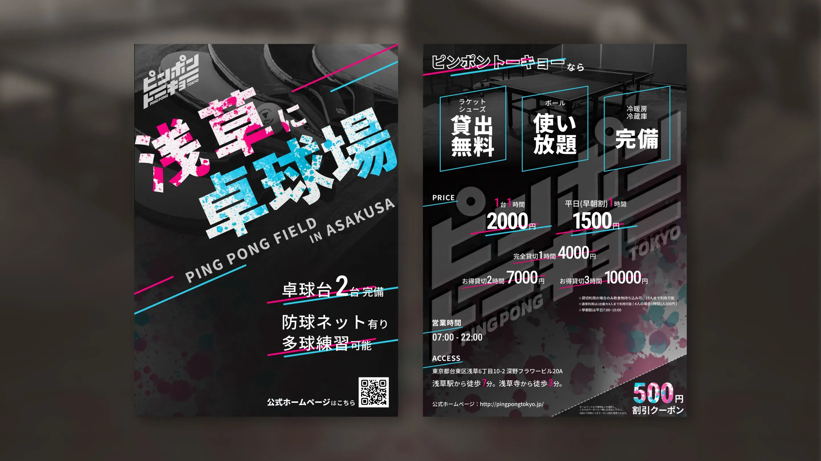
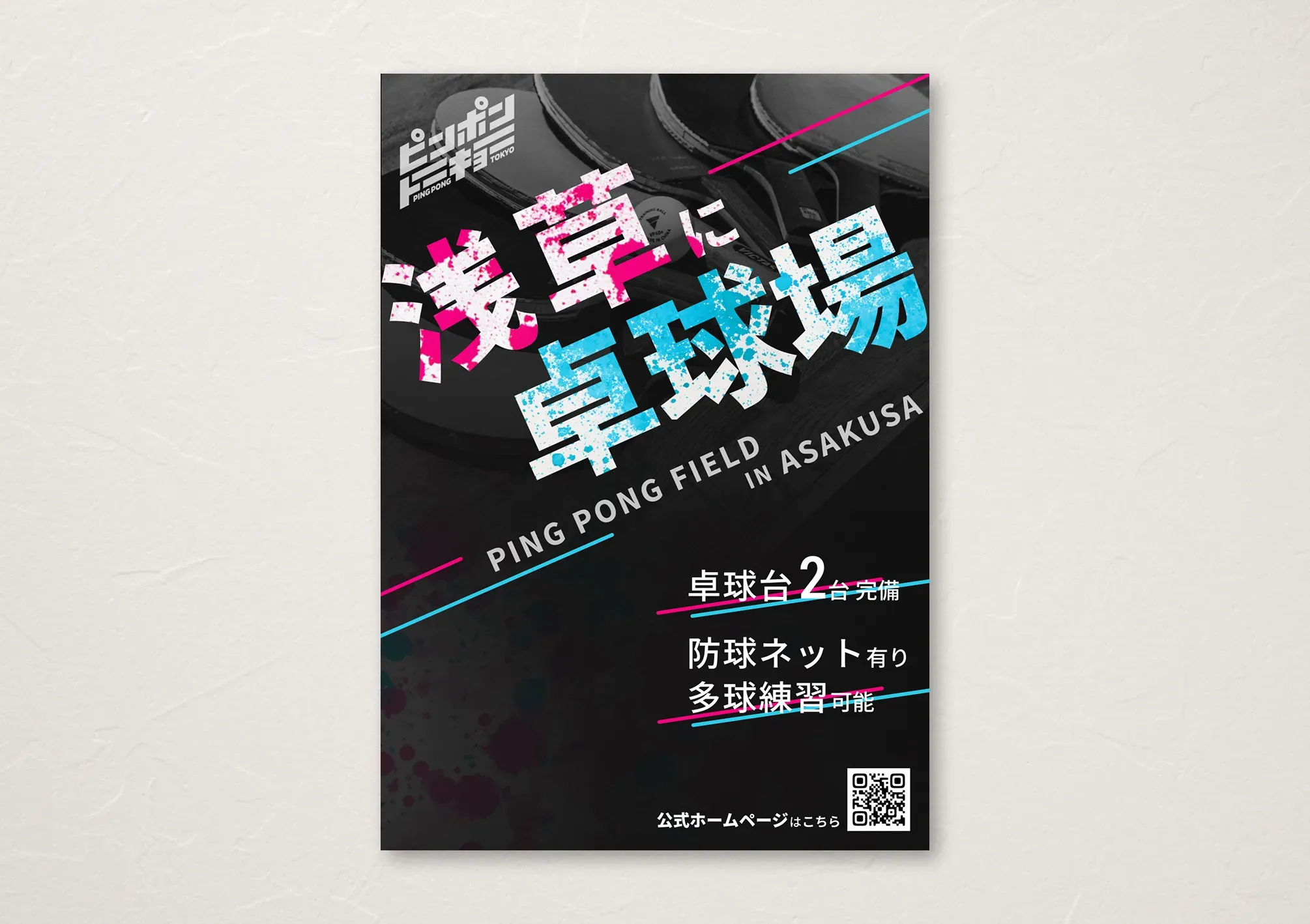
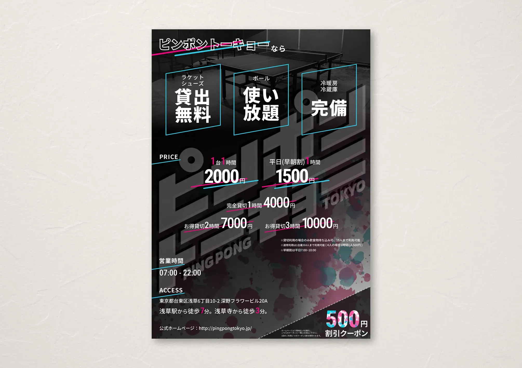
A promotional flyer created as design practice for "Ping Pong Tokyo," a newly opening table tennis venue in Asakusa, targeting primarily men in their 20s and 30s.
Design Concept
Since the target audience is men in their 20s and 30s living in Tokyo, I aimed for a sophisticated, stylish atmosphere that would appeal to urban professionals, while ensuring the design would leave a strong first impression.
Color and Visual Strategy
To create a refined impression, I chose black as the base color and converted background photos to grayscale. To enhance visual impact, I drew inspiration from the red and blue of table tennis paddles, using brightened pink and light blue to create strong contrast against the black background.
However, using these two colors at full intensity would create an overpowering and monotonous impression, so I limited decorative elements to thin lines, while the main text "Table Tennis Venue in Asakusa" features a splatter effect with pink and light blue paint on a white base, strengthening impact while maintaining the sophisticated atmosphere.
Layout Expression
Following the logo design, I used upward-slanting lines and text throughout, expressing the dynamic energy of table tennis as a sport.
Note
*This is a mock project - the venue does not actually exist.